

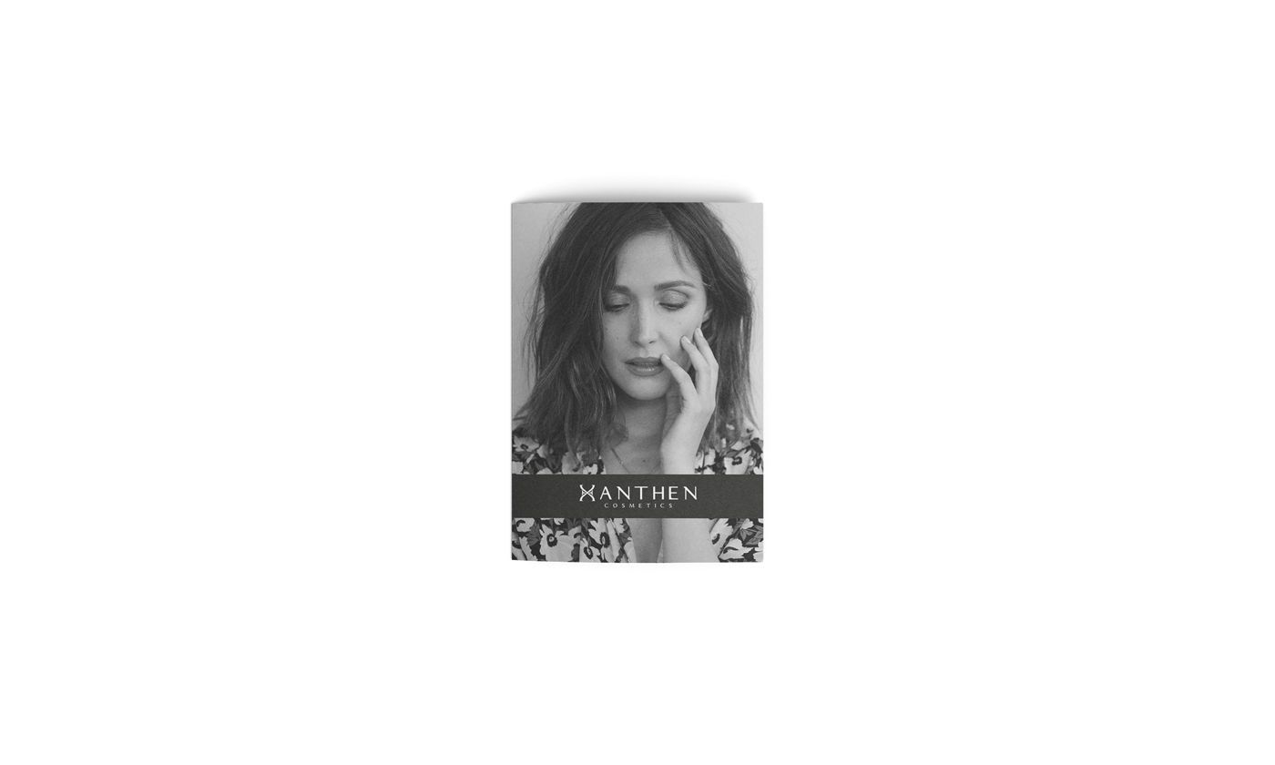
Xanthen Cosmetics
Branding | Packaging

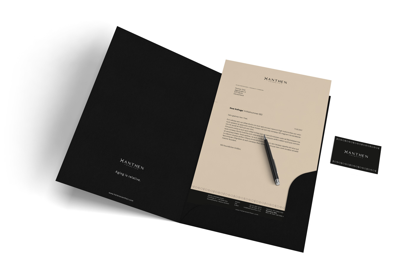
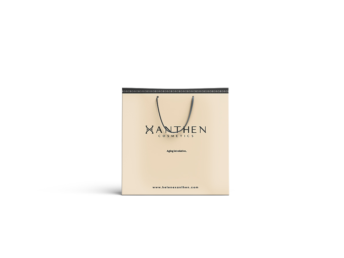
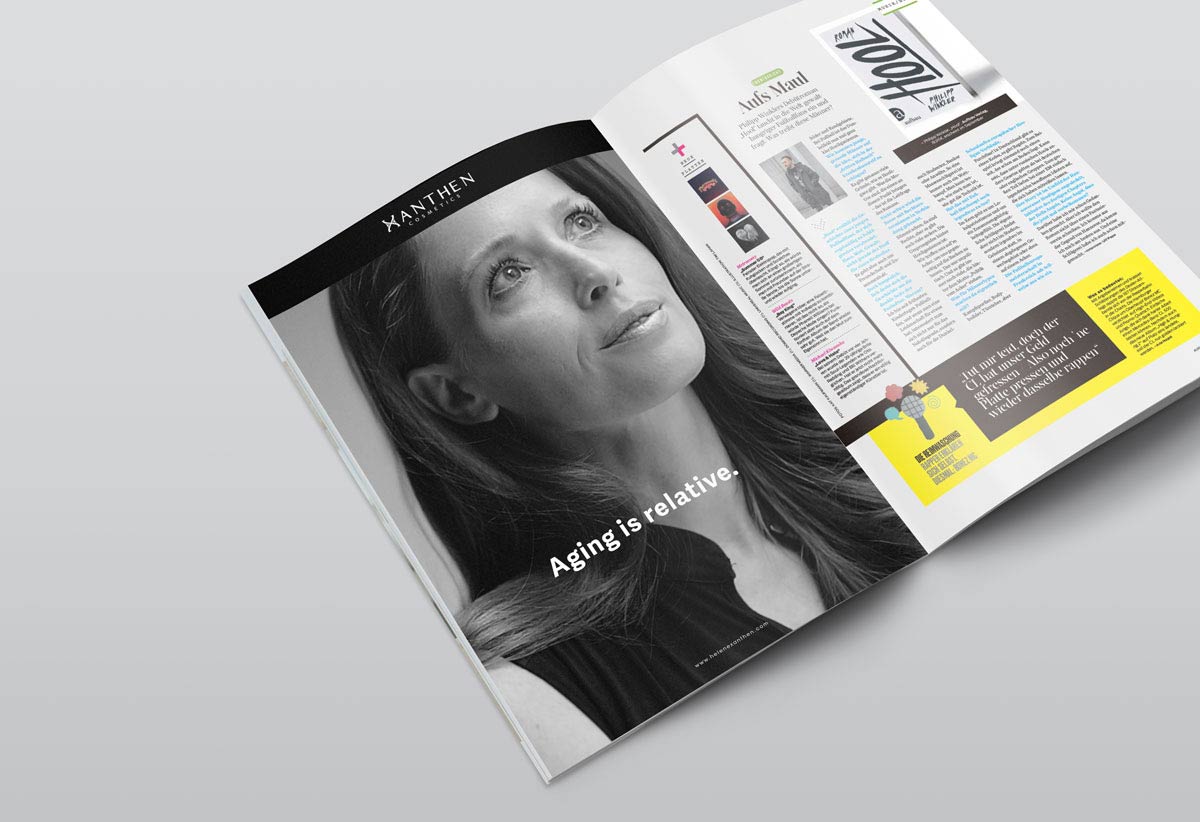
Aging is relative
Aging is part of our development and is described as a complex process. People have always put great emphasis on their appearance. Mainly on the purity of her skin, because tight skin is evidence of vitality and healthy lifestyle. To keep the skin young, there are various tricks and recipes. Daily care and the facial cleaning after the wash should be accustomed. A facial scrub should also be part of the nursing routine. A healthy diet can also help here, but also home remedies or various cosmetic products. The last point is a huge issue as the market for anti-aging products is now very wide.
Description
Skincare
Date
September 2016
Category
Corporate Design, Packaging, Advertising
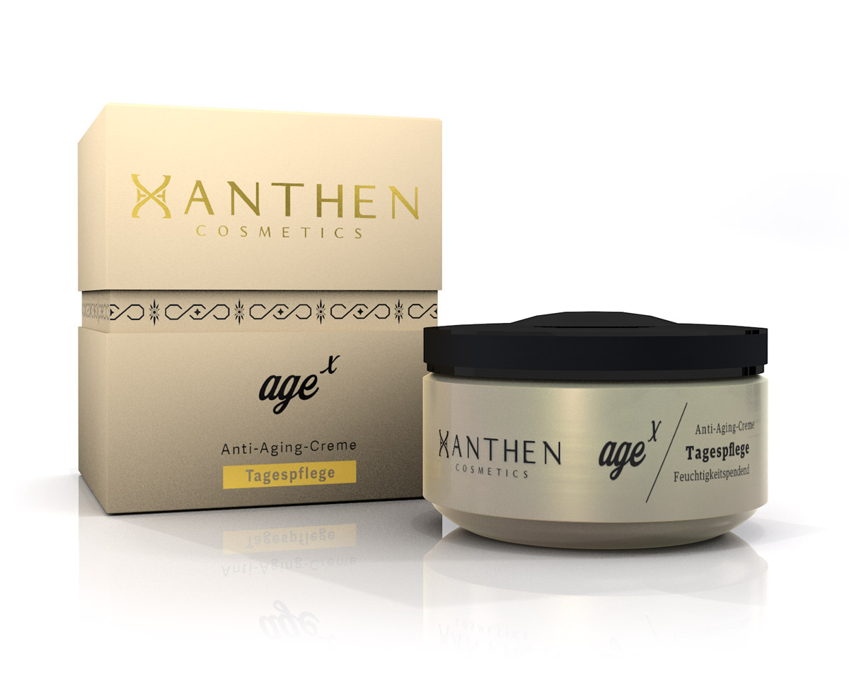
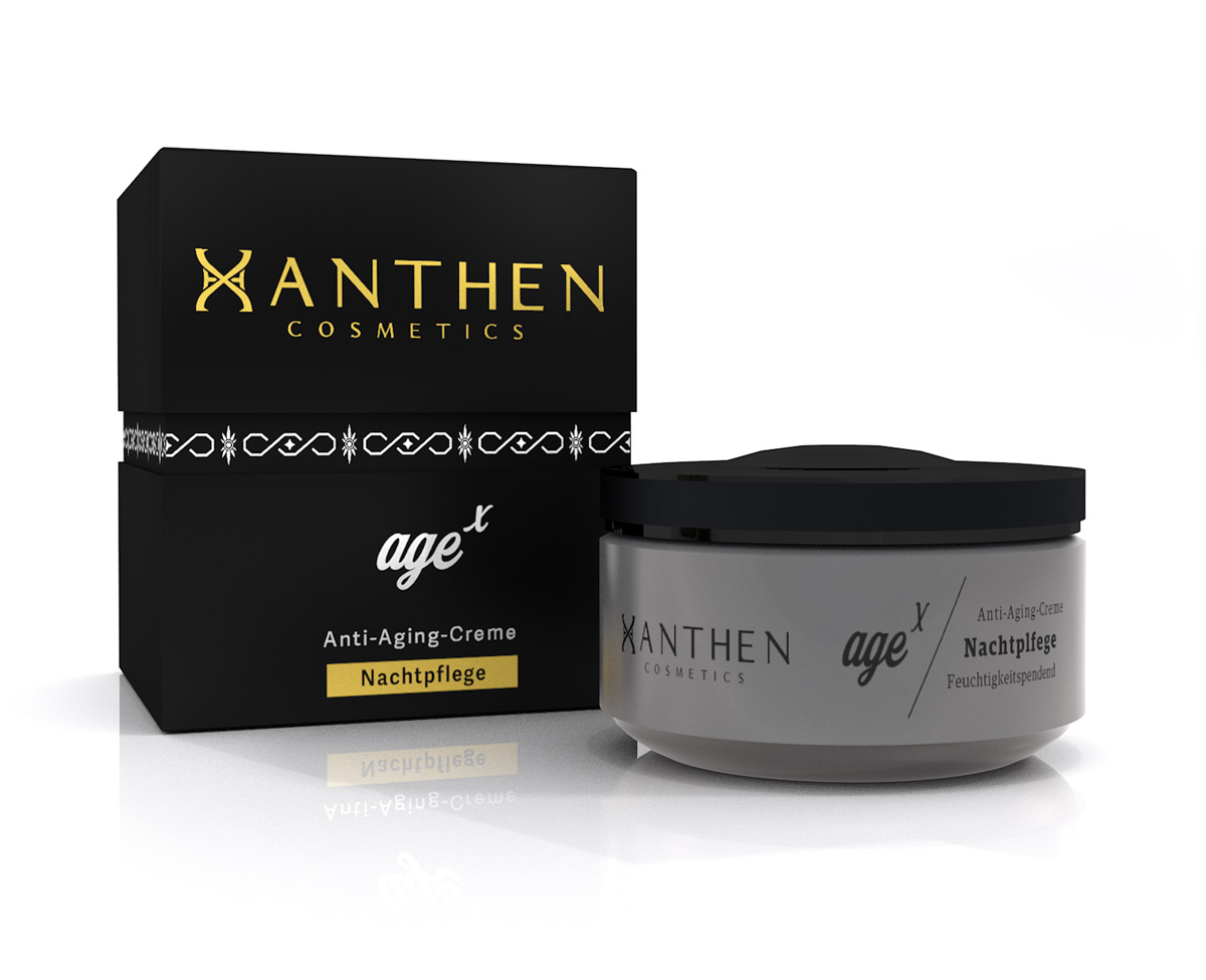
Product
For the day
in ivory
(height:4,1cm)

For the night
in anthracite
(height:4,1cm)
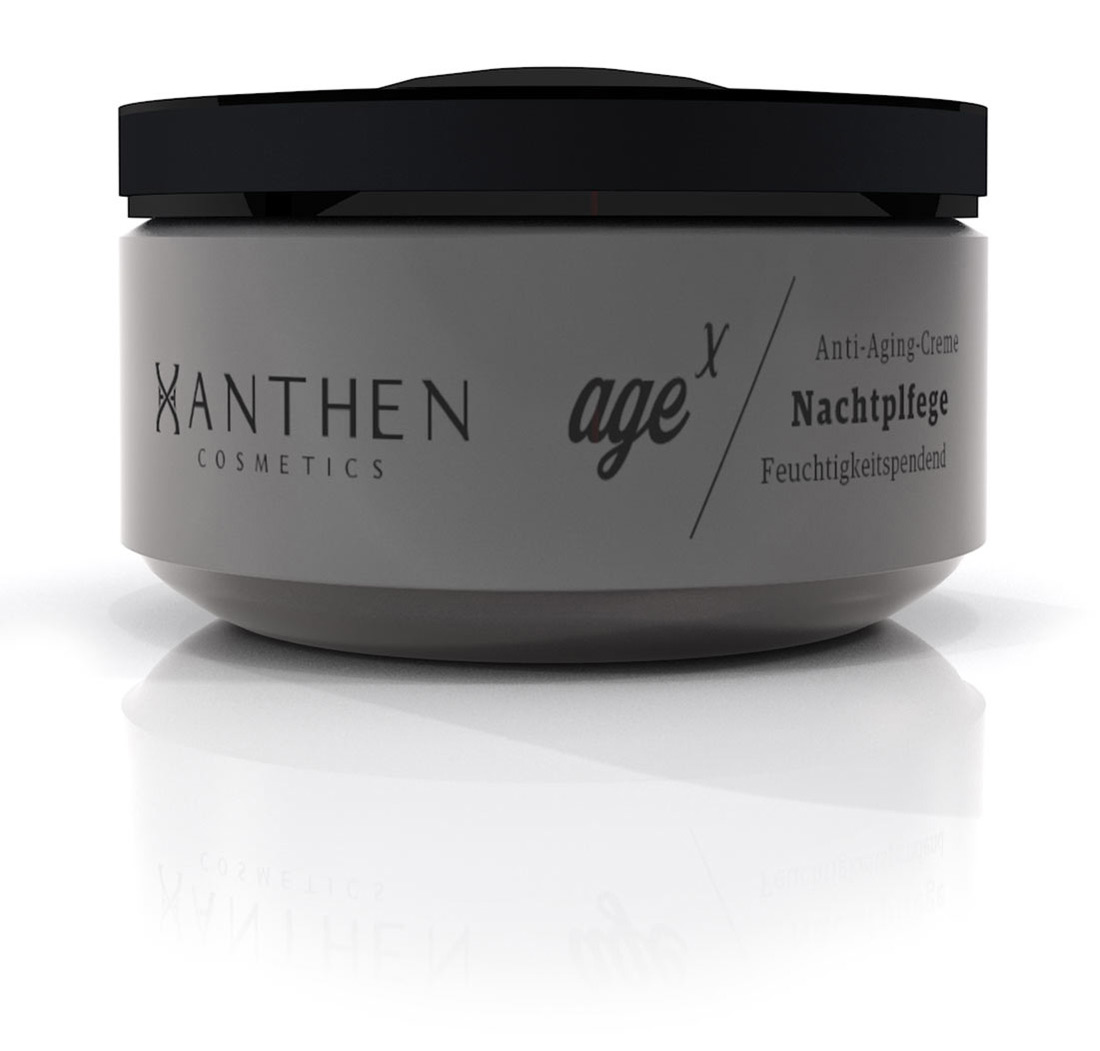
Packaging
Corporate Design
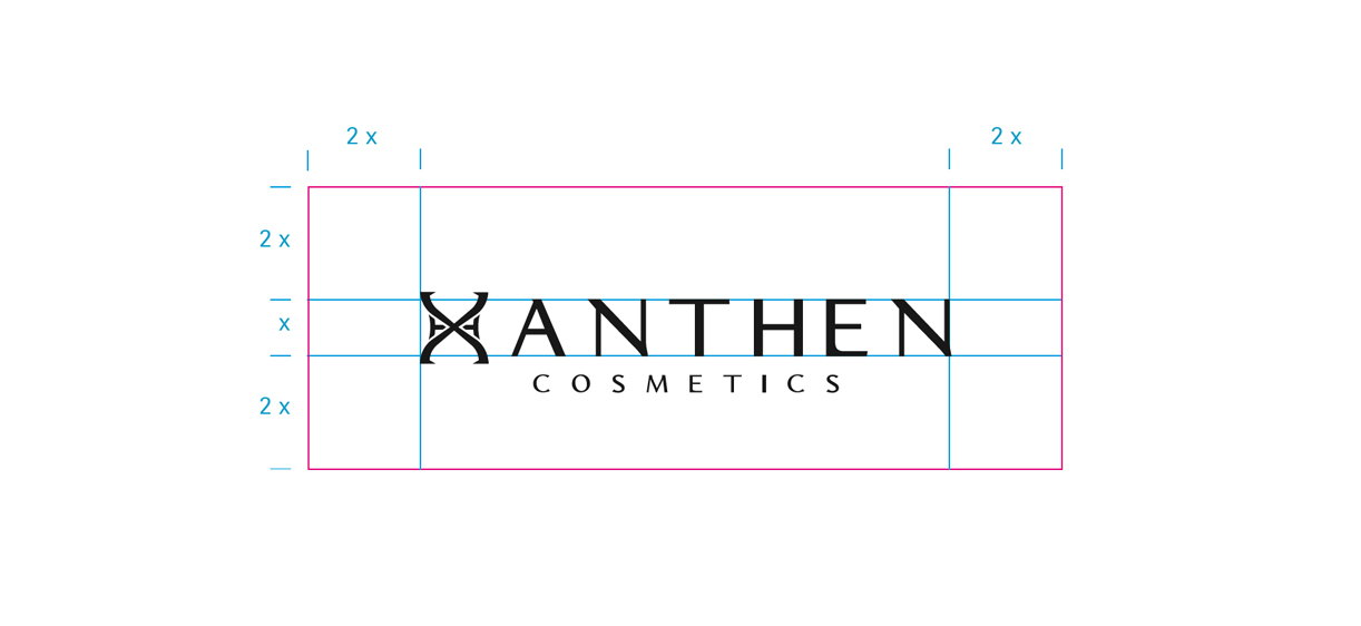
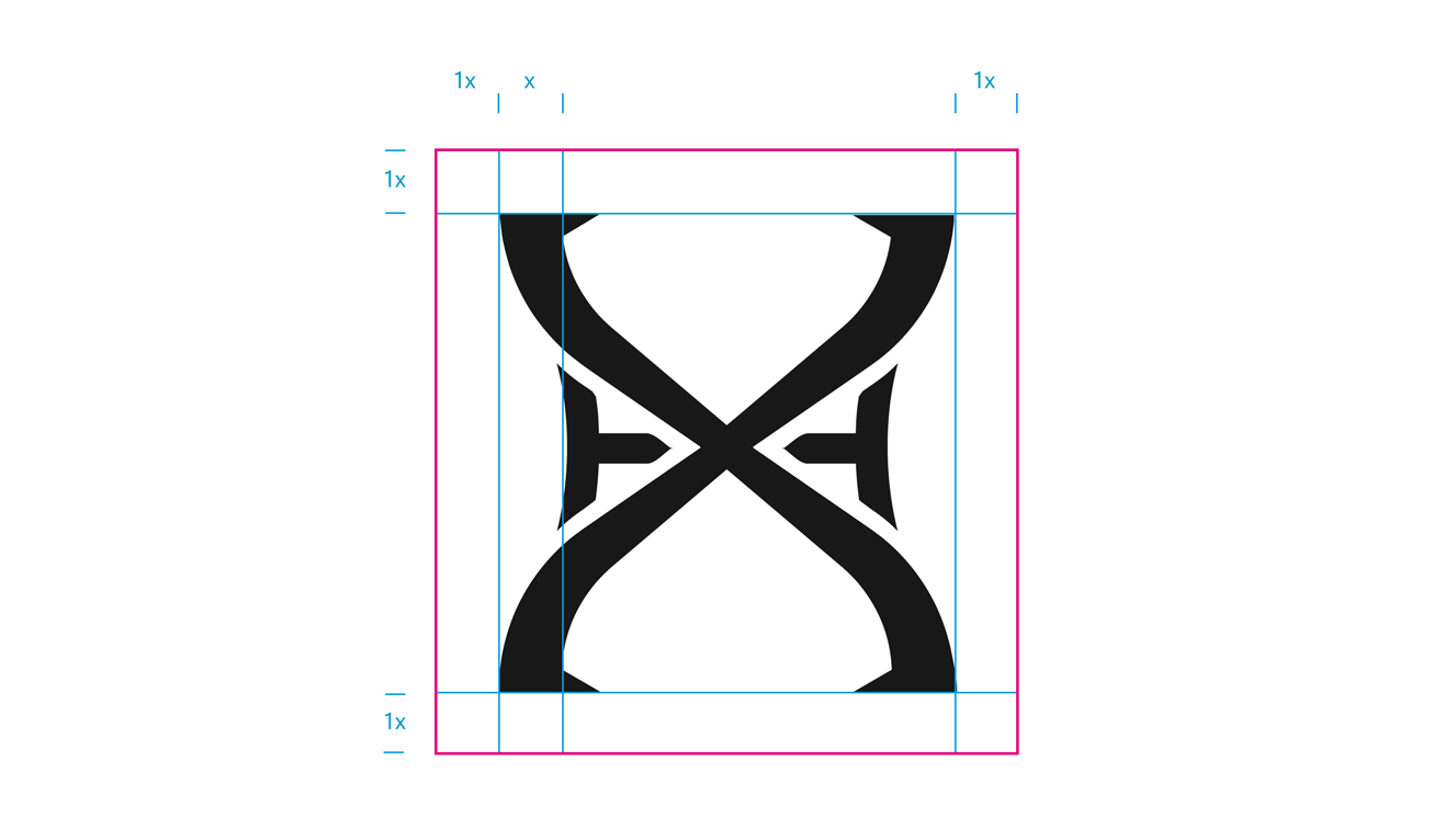
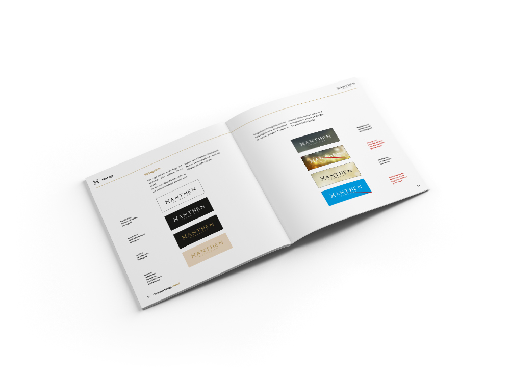
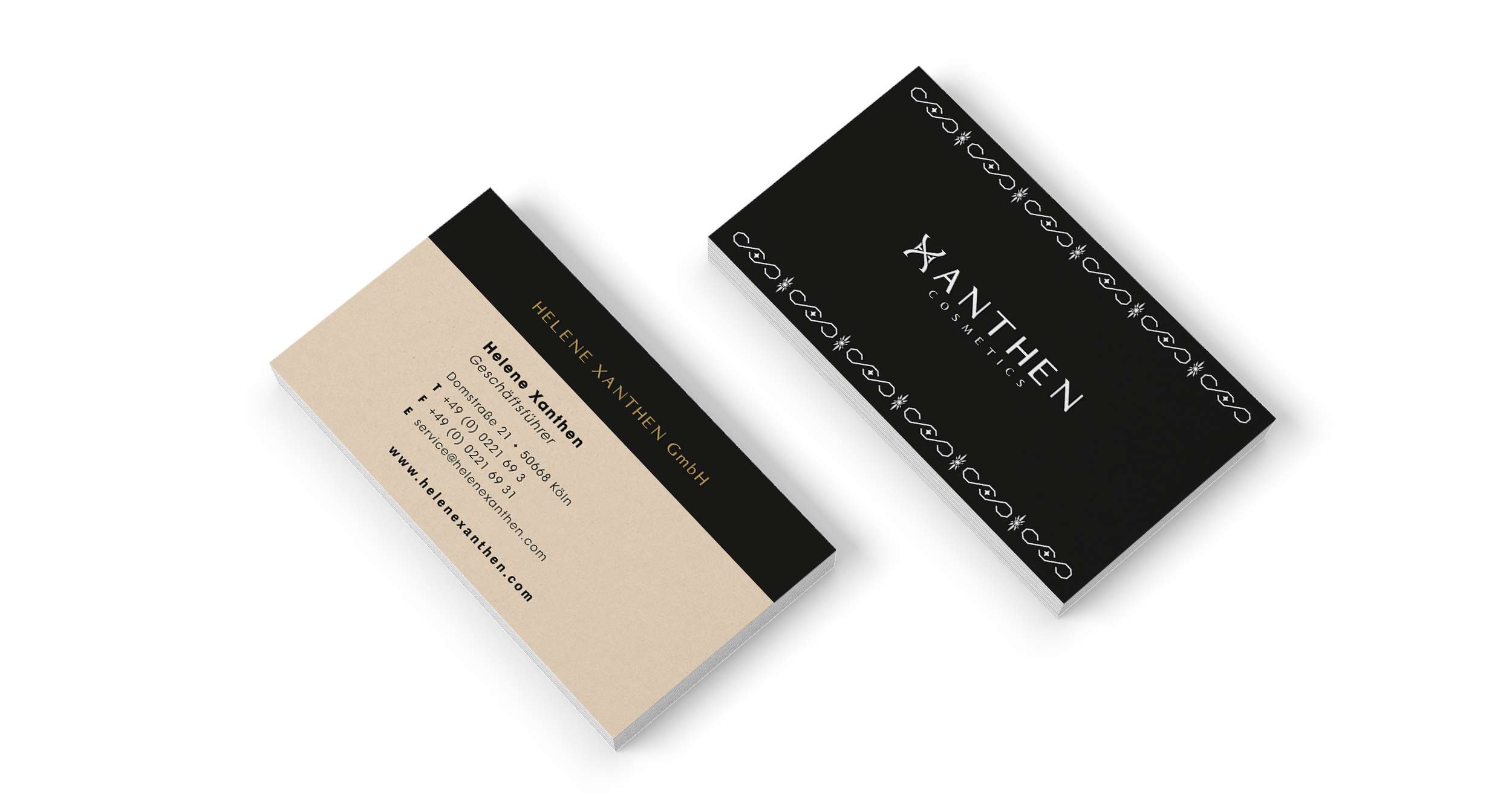
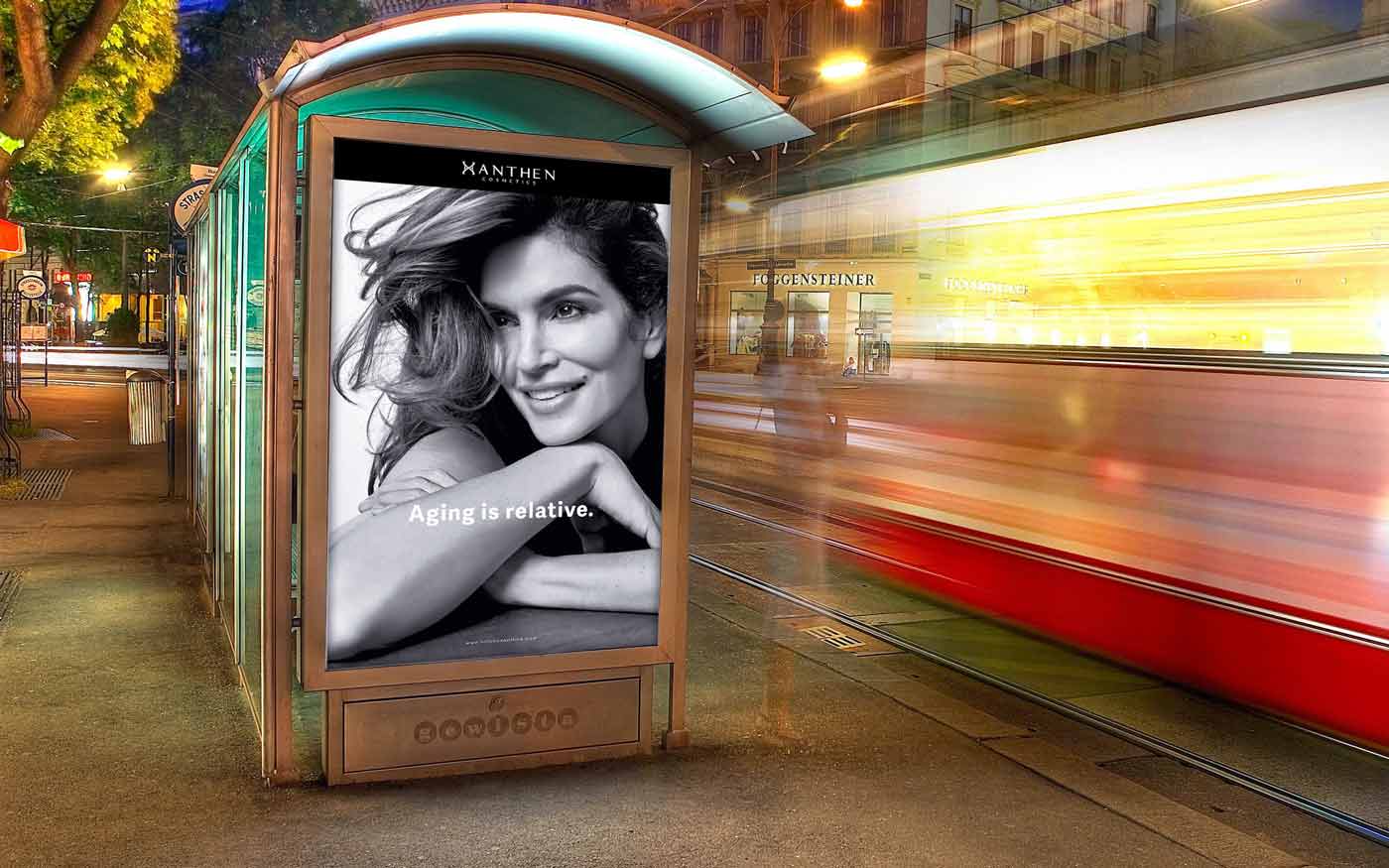
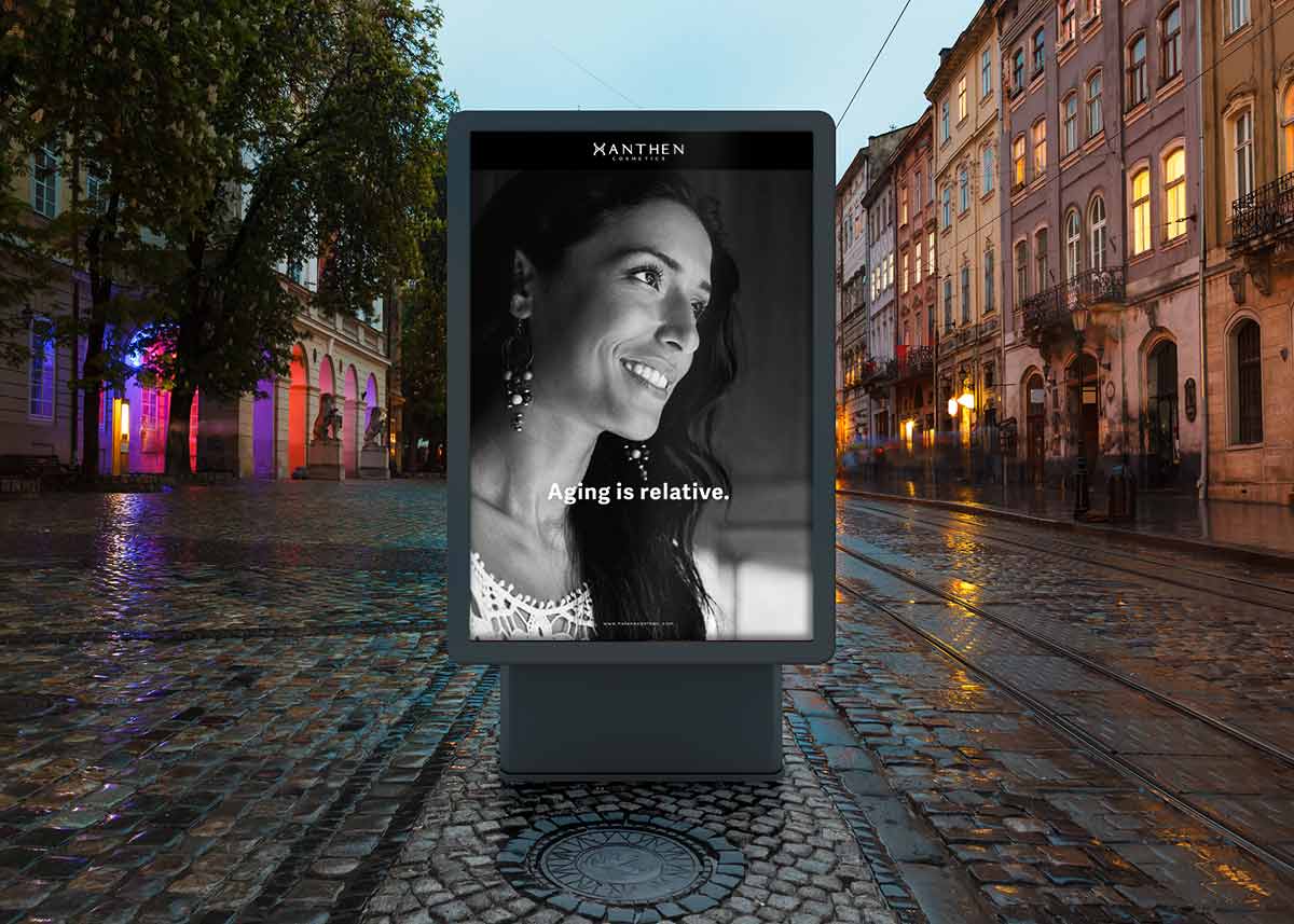
The logo is a word / picture mark, which consists of the "HX" and the lettering. These two elements compose the brand name "XANTHEN COSMETICS". The two elements are in a fixed ratio to each other and it is not allowed to modify them. The lettering which is composed with the logo is exclusively written with the font "Aristocrat". The super-sign "HX", is always read as an "X", indicates a shape of an hourglass. It is used as a picture mark and identification element of the brand.
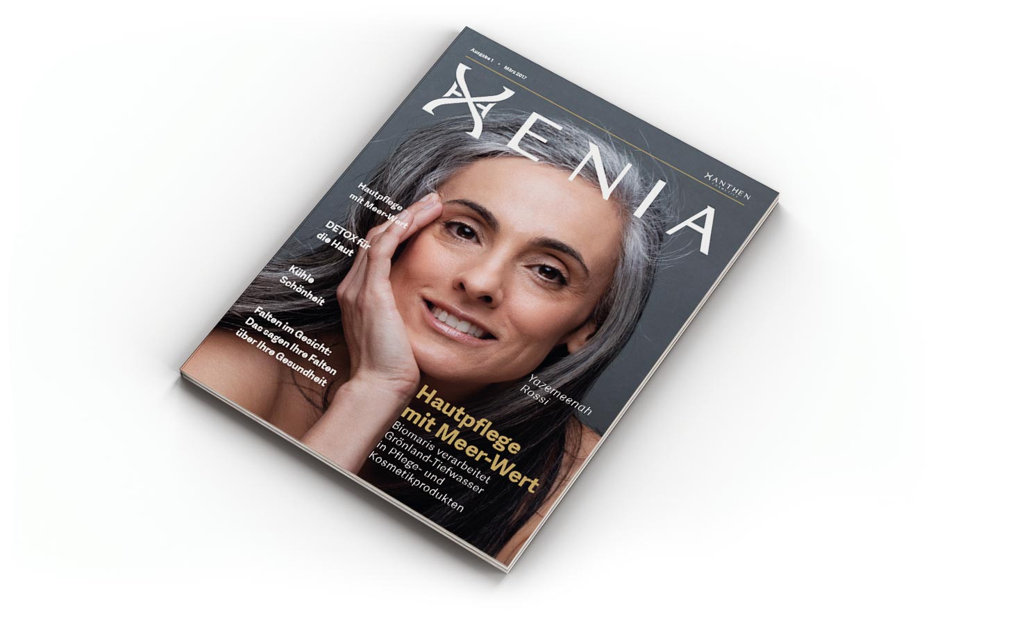
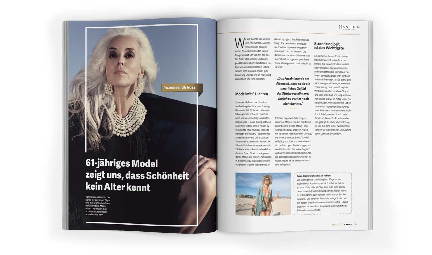
Corporate Publishing
Advertising
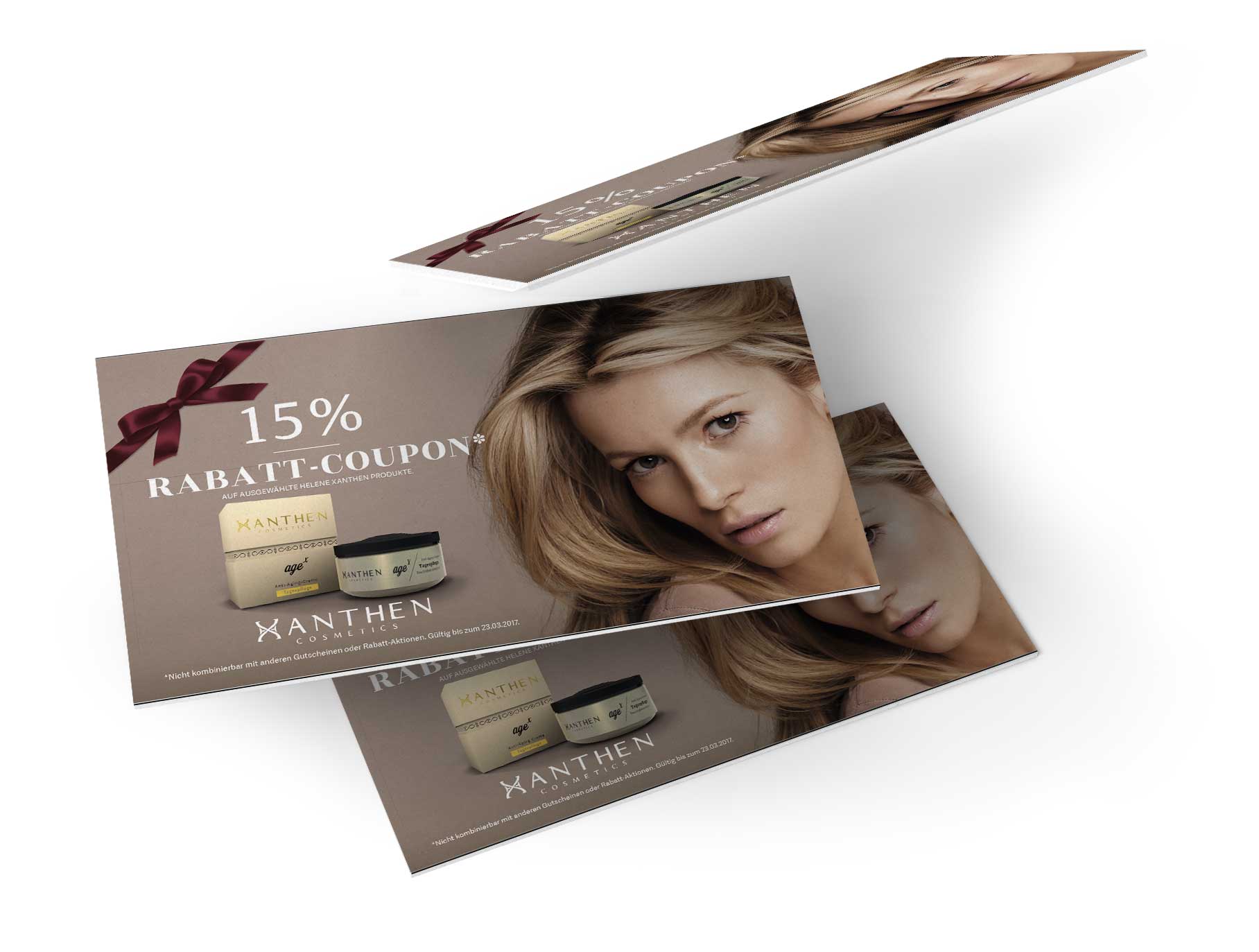
That's the slogan for the brand and also the slogan for the advertising campaign which are used in magazines and billboards.
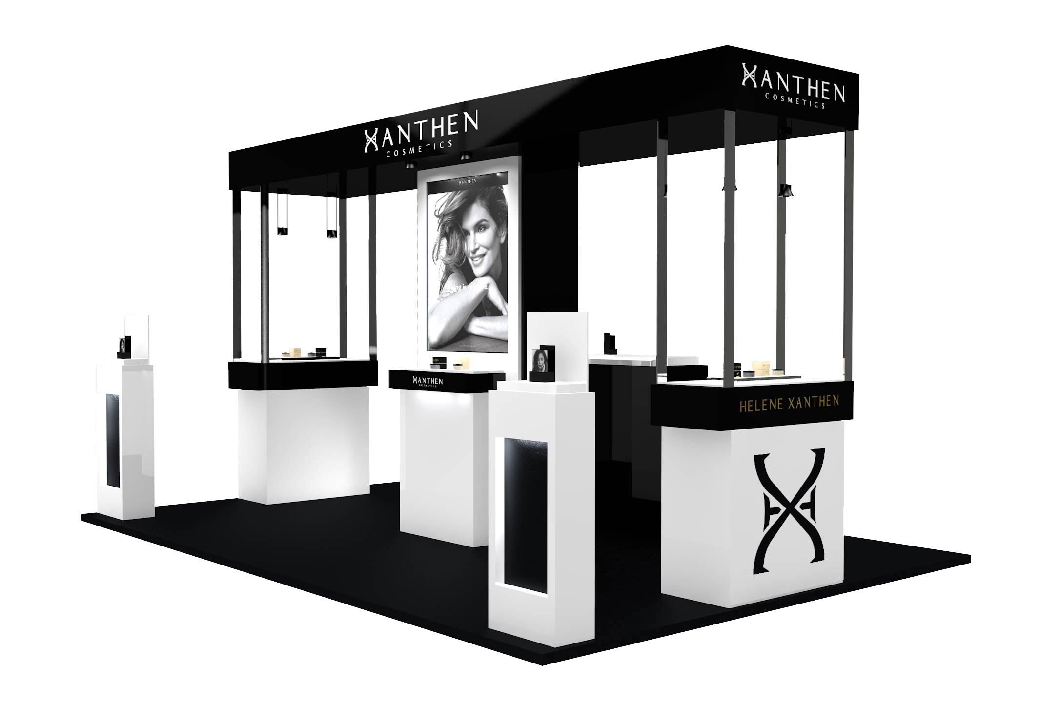
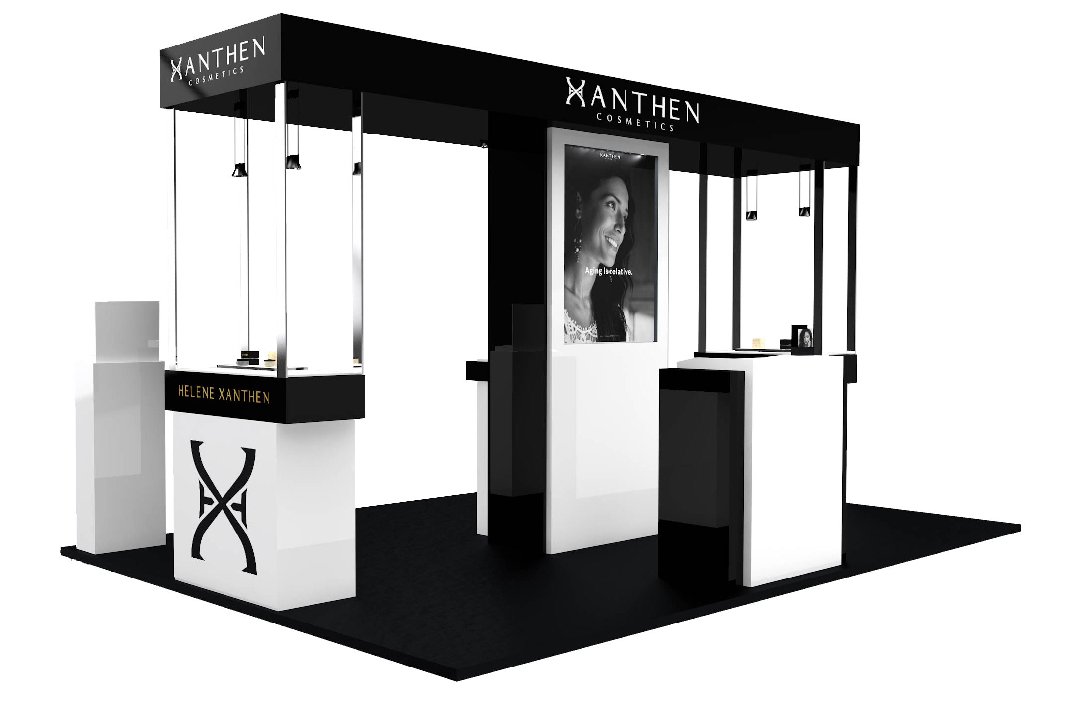
Exhibition